
如果你也是一名數據科學家,你一定明白,無論你對數據的理解和研究有多深入,你最終對結果的判斷都將基於你視覺化成果。更糟的是,對於隨機觀察者來說,這些圖表不僅需要具有資訊量和直觀性,還要具有潮流感。
在我看來,python matplotlib和seaborn樣式有些乏味,而且被過度使用。有時,它們甚至會讓人覺得作者沒有投入太多時間或精力。為了給繪圖增添亮點,我發現了6個Python庫,它們可以在常規的線圖/散點圖、直方圖和其他基本視覺化圖上增加色彩。每個庫都有對應的github repo連結!
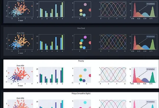
首先,生成一些綜合數據。使用每個庫制作4個子圖,這樣就可以在同類數據上對它們進行比較。
import matplotlibimport matplotlib.pyplot as pltimport numpy as npimport pandas as pdimport seaborn as sns'''Generating points to create a scatter plot'''def scatter(): x = np.random.random(100) y = x-np.random.random(100) z = np.random.randint(0,4,100) df = pd.DataFrame({'X':x, 'Y': y, 'Z':z}) return df'''Generating points to create a line plot'''def line(): x = np.arange(0,10,0.1) y_1 = np.sin(x) y_2 = np.sin(x+5) y_3 = np.sin(x+10) y_4 = np.sin(x+15) y_5 = np.sin(x+20) df = pd.DataFrame({'X':x,'y_1':y_1, 'y_2':y_2, 'y_3':y_3, 'y_4':y_4, 'y_5':y_5}) return df'''Sampling data from several distributions'''def hist(): x_1 = np.random.normal(1,0.1,1000) x_2 = np.random.gamma(1,0.25,1000) x_3 = np.random.normal(0.4, 0.1,1000) x_4 = np.random.normal(-0.1, 0.3,1000) df = pd.DataFrame({'X_1': x_1, 'X_2':x_2, 'X_3': x_3, 'X_4':x_4}) return df
註意: 沒有特定的顏色或圖案,只是在同一組繪畫中套用一種風格。
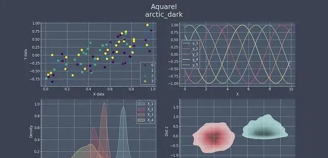
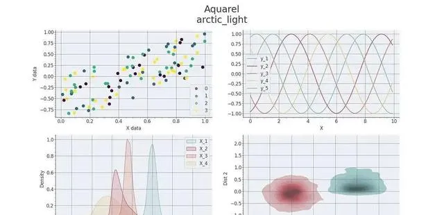
1. Aquarel
Aquarel庫[1] 提供 11 種 不同的樣式,包括深色和淺色樣式,可使用 pip 安裝:
pip install aquarel
可以像下面這樣使用上下文管理器來使用這些主題:
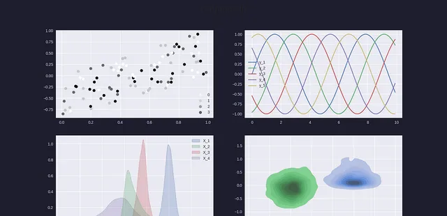
with load_theme("arctic_light"): fig, ax = plt.subplots(ncols=2, nrows=2, figsize=(16,9)) df = scatter() f= ax[0,0].scatter(df.X,df.Y, c=df.Z, s=50) ax[0,0].set_xlabel('X data') ax[0,0].set_ylabel('Y data') handles, labels = f.legend_elements(prop="colors", alpha=0.6) legend2 = ax[0,0].legend(handles, labels, loc="lower right") df=line() df.plot(x='X', ax=ax[0,1]) df=hist() sns.kdeplot(df, fill=True, ax=ax[1,0]) ax[1,0].set_xlabel('Value') sns.kdeplot(df, x="X_1", y="X_2", fill=True, ax=ax[1,1]) sns.kdeplot(df, x="X_3", y="X_4",fill=True, ax=ax[1,1]) ax[1,1].set_xlabel('Dist 1') ax[1,1].set_ylabel('Dist 2') plt.suptitle('Aquarel\narctic_light', fontsize=24) plt.savefig('arctic_light.jpg') plt.show()
或者,你也可以直接使用
from aquarel import load_themetheme = load_theme("arctic_light")theme.apply()# ... plotting code heretheme.apply_transforms()
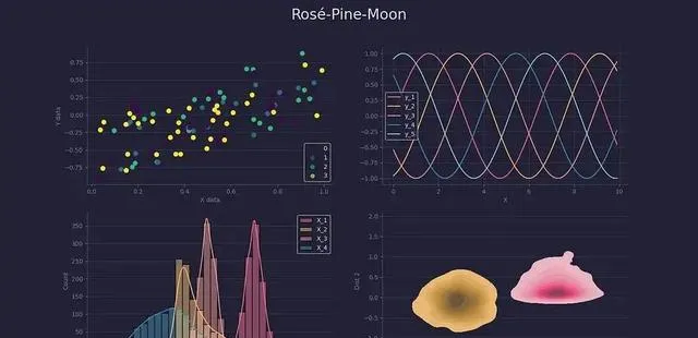
2. Rosé Pine
第二個 repo[2] 我非常喜歡,它不是一個庫,而是一組主題,你需要下載這些主題,然後指定 matplotlib 的路徑:
plt. style.use('./themes/rose-pine-moon.mpl style')
之後,只需要按照相同的繪圖步驟進行即可。這個軟體包的顏色非常溫和,同時對比度也很高。
3. Catppuccin
需要使用 pip 安裝 Catppuccin庫[3] 。它包括 4 種不同的風格和不同的暗度。
matplotlib. style.use("mocha")
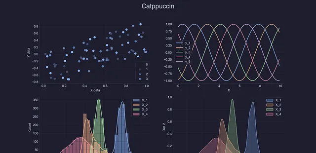
Catppuccin軟體包還提供了一個有趣的功能,可以將不同的樣式表進行混合。可以嘗試將基本的seaborn-v0_8-dark和mocha樣式表結合起來。
Catppuccin混合主題
4. mplcyberpunk
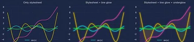
下一個庫 mplcyberpunk[4] 非常有名,每個人都鐘愛賽博龐克,這款軟體不僅能夠提供恰到好處的顏色和背景,還能為圖片添加發光效果,絕對讓人驚艷!

import matplotlib.pyplot as pltimport mplcyberpunkplt. style.use("cyberpunk")...mplcyberpunk.add_glow_effects()plt.show()
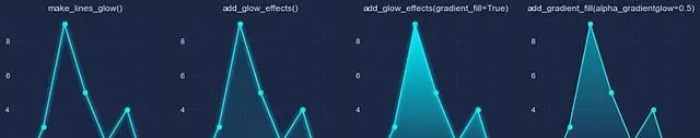
fig, ax = plt.subplots()...mplcyberpunk.make_lines_glow(ax)
5. matplotx
matplotx[5] 是matplotlib的另一個擴充套件包,可以透過pip像之前的擴充套件包一樣安裝。它提供了20種不同的主題,可用於科學研究、投影或其他任何用途,因為這些風格既有嚴謹的特點,也有非正式和時尚的風格。
6. GruvBox
今天的最後一個是 GruvBox[6] 。,它不是一個真正的庫,而是一個檔,適用時需要上傳它:
matplotlib. style.use("./gruvbox.mpl style")
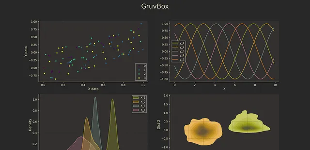
盡管這個軟體倉庫中只有一個主題,但我非常喜歡它的字型、線條和背景顏色的搭配!
希望以上的內容能夠幫助到你~
參考資料
[1] Aquarel庫: https://github.com/lgienapp/aquarel
[2] repo: https://github.com/ppZ/rose-pine-matplotlib
[3] Catppuccin庫: https://github.com/catppuccin/matplotlib
[4] mplcyberpunk: https://github.com/dhaitz/mplcyberpunk
[5] matplotx: https://github.com/nschloe/matplotx
[6] GruvBox: https://github.com/thriveth/gruvbox-mpl/tree/master


