
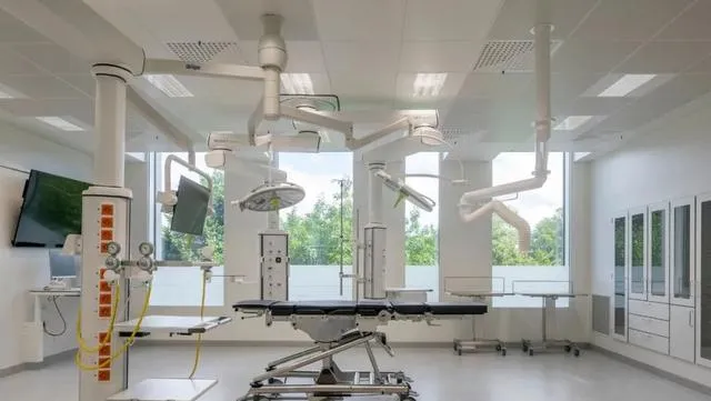
Rigshospitalet北翼有200多个病房、手术室、一个重症监护病房和门诊部。设计的指导原则是病人的健康和康复,保健专业人员的需要,以及医院功能的未来适应性。
Rigshospitalet的新北翼扩建旨在鼓励每个病人的康复,同时优化医院工作人员的效率和功能。
Text description provided by the architects. Rigshospitalet North Wing features more than 200 patient rooms, operating rooms, an intensive care unit, and outpatient clinics. The guiding principles of the design are patient well-being and healing, the needs of healthcare professionals, and the future adaptability of the hospital functions. The new North Wing extension to Rigshospitalet aims to encourage the recovery of each patient while optimising the efficiency and functionality of the hospital staff.
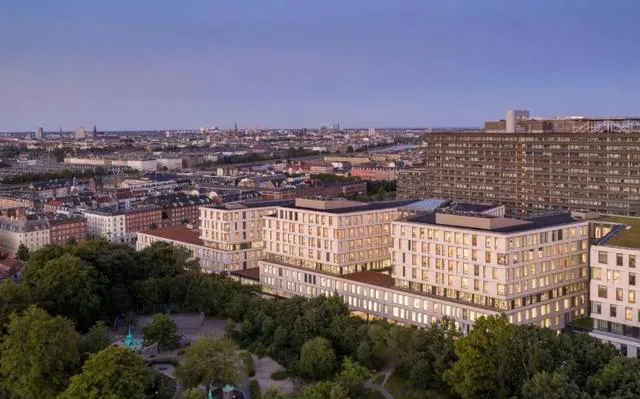
新侧翼有七层,共209个病房(196个是带有私人浴室的单间),33个手术室,一个重症监护病房,门诊诊所,诊断成像功能和研究空间。
北翼的设计和布局是LINK arkitektur和3XN以及Sweco工程公司密切合作的结果。
该项目的其他贡献者包括景观设计师Kristine Jensen Tegnestue和德国建筑师事务所Nickl & Partner。
The new wing is spread out over seven floors and offers a total of 209 patient rooms (196 are single rooms with private bathrooms), 33 operating rooms, an intensive care unit, outpatient clinics, diagnostic imaging functions, and research spaces. The design and layout of the North Wing are the results of a close collaboration between LINK arkitektur and 3XN, as well as the engineering firm Sweco. Additional contributors to the project include the landscape architect Kristine Jensen Tegnestue, and the German architect firm Nickl & Partner.

优化医院内部的流程,受心电图上线条的启发,北翼呈之字形,与贯穿整个机翼的主要「动脉」路线相交。
笔直的中央走道让员工可以轻松地从建筑的一端走到另一端,而周围的曲折结构意味着安静区和病房远离中央走廊,避免不必要的干扰。
因此,锯齿形的形式有许多用途:它通过优化员工的循环路线来缓解医院的流动,同时为病人提供更多的舒适和尊严,使其远离繁忙的医院环境。
Optimising the flow within the hospital. Inspired by the lines on a cardiogram graph, the North Wing is shaped like a zigzag and is intersected by a main ‘artery’ route that runs through the entire wing. The straight, central walkway allows staff to navigate easily from one end of the building to the other, while the surrounding zigzag structure means quiet zones and patient rooms are located away from the central corridor, avoiding unnecessary disturbances. The zigzag form thus serves numerous purposes: it eases the flow through the hospital by optimising the staff’s circulation routes while offering patients more comfort and dignity to recover away from the busy hospital environment.
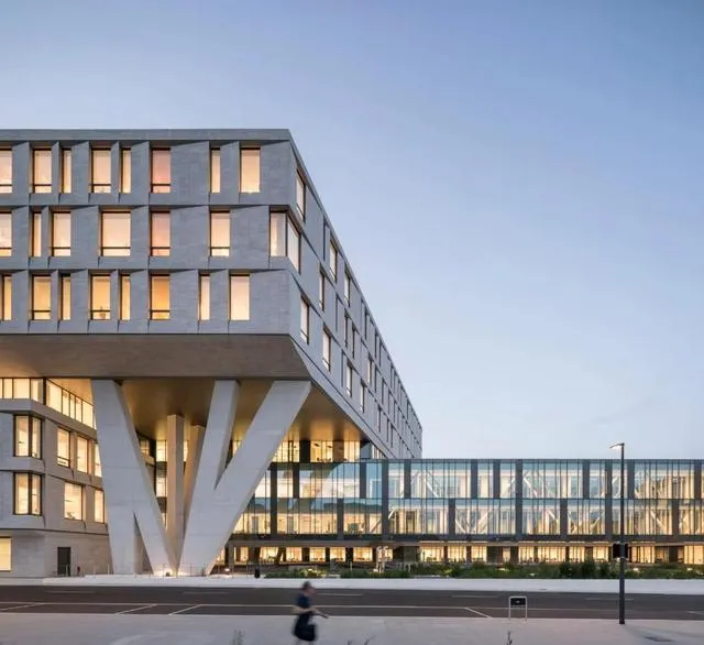

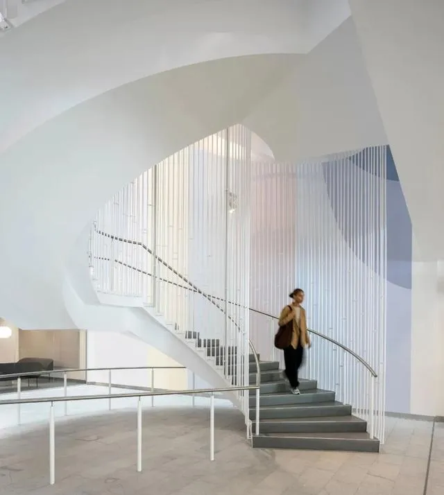
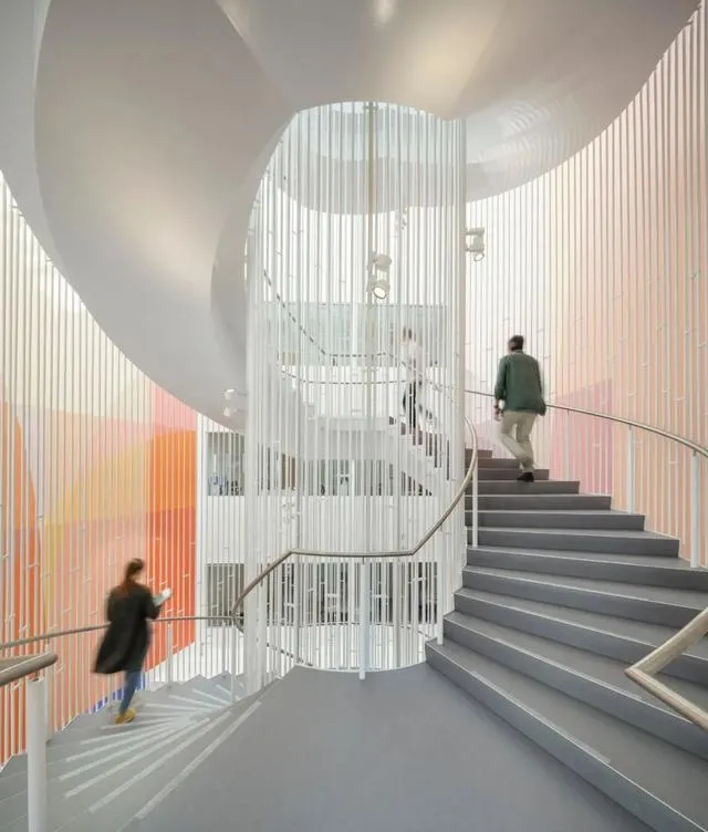
清晰和容易的导航。病房和门诊部分布在三层,由一个连续的轴线连接。到达区为日间患者进行了优化,而术前和术后区域被放置在手术区域的旁边。两个螺旋楼梯和四个中央电梯塔连接楼层到中央公共区域。
楼梯位于开放的中庭,日光从玻璃天花板和立面的大玻璃部分进入建筑。公共等候区与每层的两个楼梯相连。为了帮助定位,每一层都有自己专用的色彩方案应用到门、地板和选定的墙壁上。
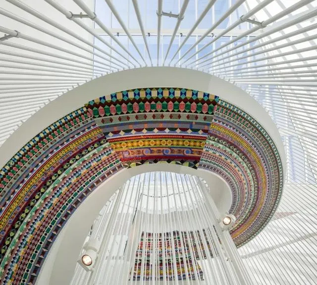
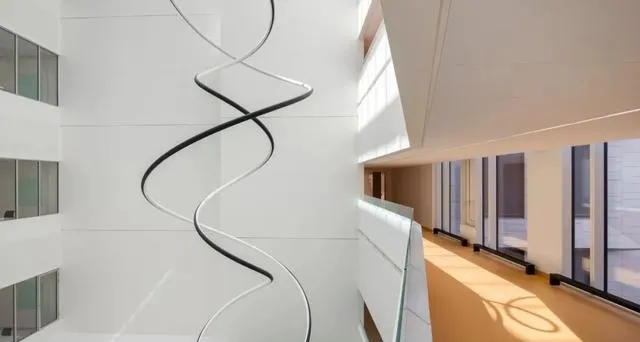
Olafur Eliasson、Malene Landgreen和Erik A. Frandsen的艺术作品为建筑带来了色彩和活力,软化了传统无菌的医院环境。在中庭展示的艺术作品被巧妙地放置以让尽可能多的人欣赏,包括从外面路过的行人。
Clear and easy navigation. Wards and outpatient clinics are laid out over three floors and are connected by a continuous axis. Arrival areas are optimised for day patients, while the pre- and postoperative areas are placed next to the operating areas. Two spiral staircases and four central elevator towers connect the floors to the central common area. The staircases are located in the open atria, where daylight flows into the building from the glass ceiling, as well as through large glass ps in the façade. Common waiting areas are established in connection to the two staircases on each floor. To help orientation, each floor has its own dedicated colour scheme applied to doors, flooring, and selected walls. Artworks by Olafur Eliasson, Malene Landgreen, and Erik A. Frandsen bring colour and life into the building, softening the traditionally sterile hospital environment. The artworks exhibited in the atria are strategically placed to be enjoyed by as many people as possible, including passing pedestrians from outside.
一个明亮而美丽的建筑。
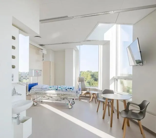
治疗性建筑一直是北翼所有楼层的指导原则。大玻璃窗让阳光进入建筑,并在室内空间和邻近的公共公园之间建立联系。
北翼内部采光充足的空间和绿色的环境有助于为病人和亲属创造一个和平的环境。其结果是医院建筑是愉快的访问,同时为病人提供最佳的恢复和幸福的条件。
北翼独特的锯齿形设计有助于利用自然光和节约能源,因为人工照明被最小化。
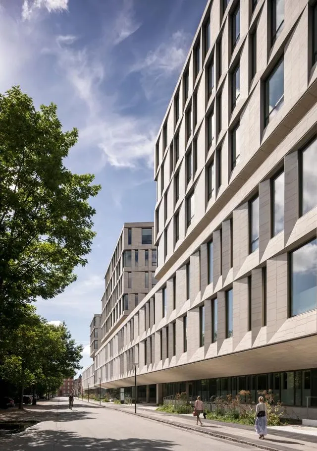
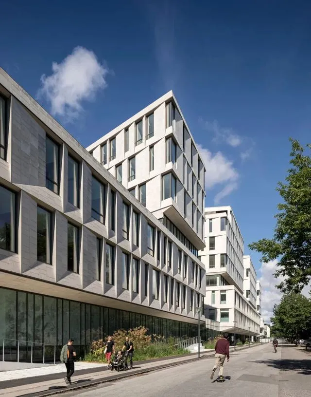
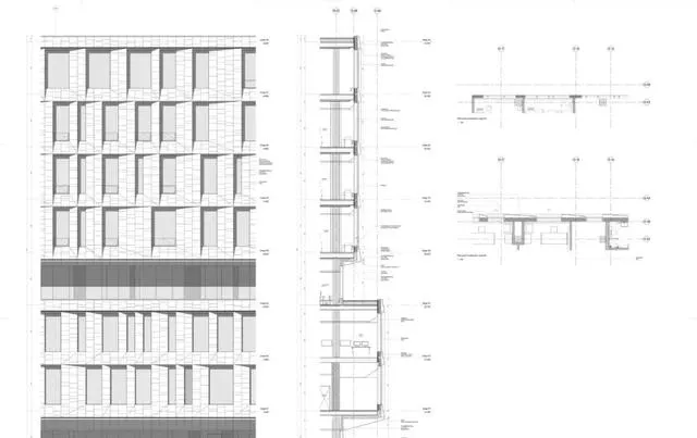
立面选用了天然轻质石材 ,给它一个明亮和受欢迎的外观。
立面的侧面增加了一种阴影的形式,也给建筑的外部一个更有活力的表达,这种表达在一天中从不同的角度变化。
A bright and beautiful building. Healing architecture has been a guiding principle at all levels of the North Wing. The large glass windows let the daylight flow into the building and create a connection between the interior spaces and the neighbouring public park Fælledparken. The daylight-filled space inside the North Wing and the green surroundings help create a peaceful environment for patients and relatives. The result is a hospital building that is pleasant to visit while providing the patients with optimal conditions for recovery and well-being. The characteristic zigzag design of the North Wing helps to harness natural daylight and save energy as artificial lighting is minimised. Natural light stone was chosen for the façade to give it a bright and welcoming appearance. Facets in the façade add a form of shade as well giving the building’s exterior a more vibrant expression that changes throughout the day and from different angles.


城市的一部分,但独一无二。
北翼与周围的环境相联系,同时仍然坚持自己独特的建筑表达。北翼的动态形式适应了周围的城市空间,从西北到东南逐渐降低尺度。
这意味着建筑相对于现有医院的高层建筑更高,而相对于马路对面的经典哥本哈根风格的住宅建筑则有所降低。
朝向fspativelledparken的立面是明亮和开放的,与公园形成对话,而不是形成一堵坚实的墙。
Part of the city – but one of a kind. The North Wing relates to its surroundings while still asserting its own unique architectural expression. The dynamic form of the North Wing adapts to the surrounding urban space, gradually lowering in scale from north-west to south-east. This means the building is taller towards the high-rise buildings of the existing hospital, while respectfully lowering down towards the classic Copenhagen- style residential buildings across the road. The façade towards Fælledparken is light and open and enters a dialogue with the park rather than forming a solid wall.

为今天做好准备,为未来做好准备。
北翼有强烈的(主题)表达,传达开放、透明、安全和人文主义——同时创造了一个持久、灵活的医院,可以根据未来的运营需求进行调整。
新的治疗方法和数字创新继续挑战现有的医院环境。因此,北翼的设计围绕着简单的原则,根据未来的需要提供了很大的灵活性和调整空间。
Ready for today and ready for the future. The North Wing has a strong expression, conveying openness, transparency, safety and humanism – while at the same time creating a long-lasting, flexible hospital that can adapt according to future operational needs. New treatment methods and digital innovations continue to challenge existing hospital settings. The North Wing is therefore designed around simple principles that provide great flexibility and space for adjustments according to future needs.


平面图


剖立面图
建筑师:3XN, LINK arkitektur
地点:丹麦
面积:54000平方米
年份:2020
*关注「洁净园」,获取更多价值干货!


